Summary
The Assignment
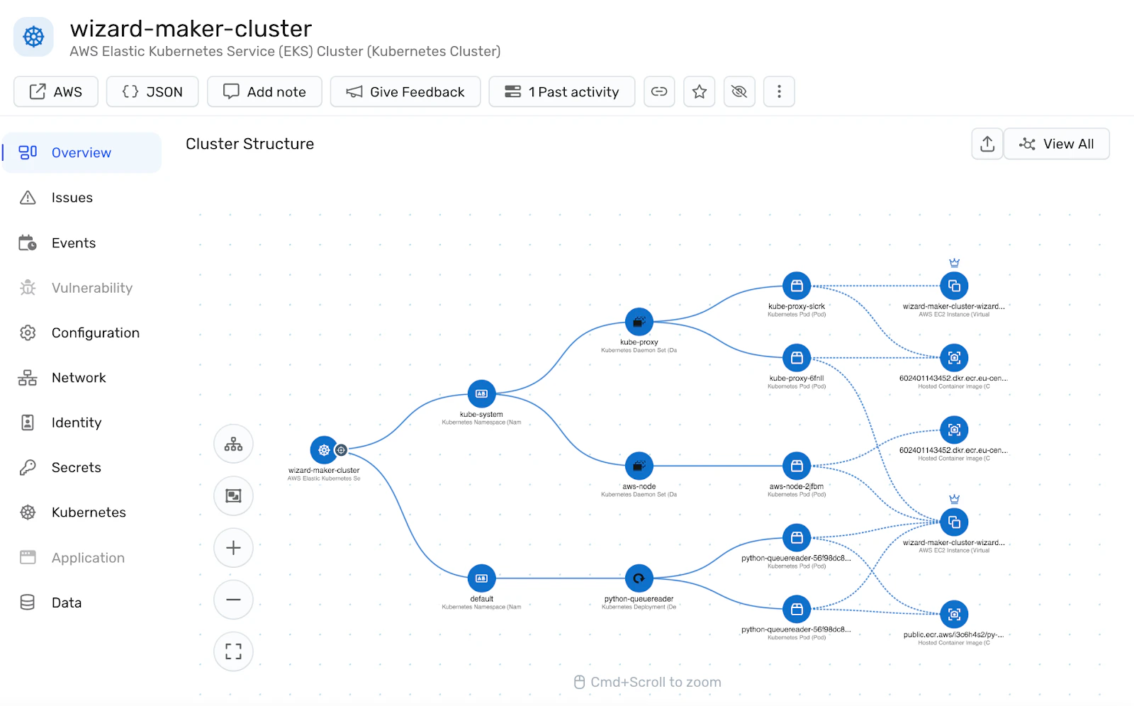
Reimagine and redesign a screen from the provided screenshot(a network architecture visualization from Wiz).
What I Uncovered
An information architecture problem. Security engineers were wasting time hunting nodes across fragmented interfaces.
My Goals:
- Empower businesses to move forward with accuracy and efficiency
Result
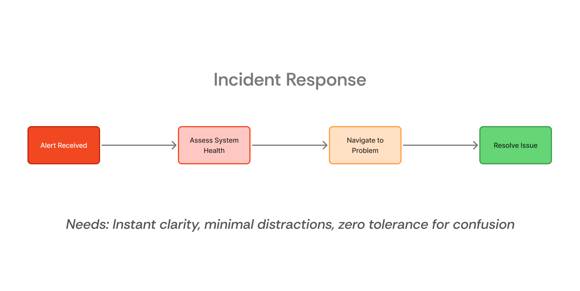
Expected time-to-action under 10 seconds, core insights accessible within 2 clicks, significant reduction in context-switching, scalable foundation that grows with your platform.
Key Design Features
Single Source of Truth
Complete the architecture in expandable clusters. Address issues or facilitate smoother alignment without navigating back and forth between multiple screens and while maintaining context.
Dual-Mode Interface
Toggle between collaborative alignment and crisis response in an instant.
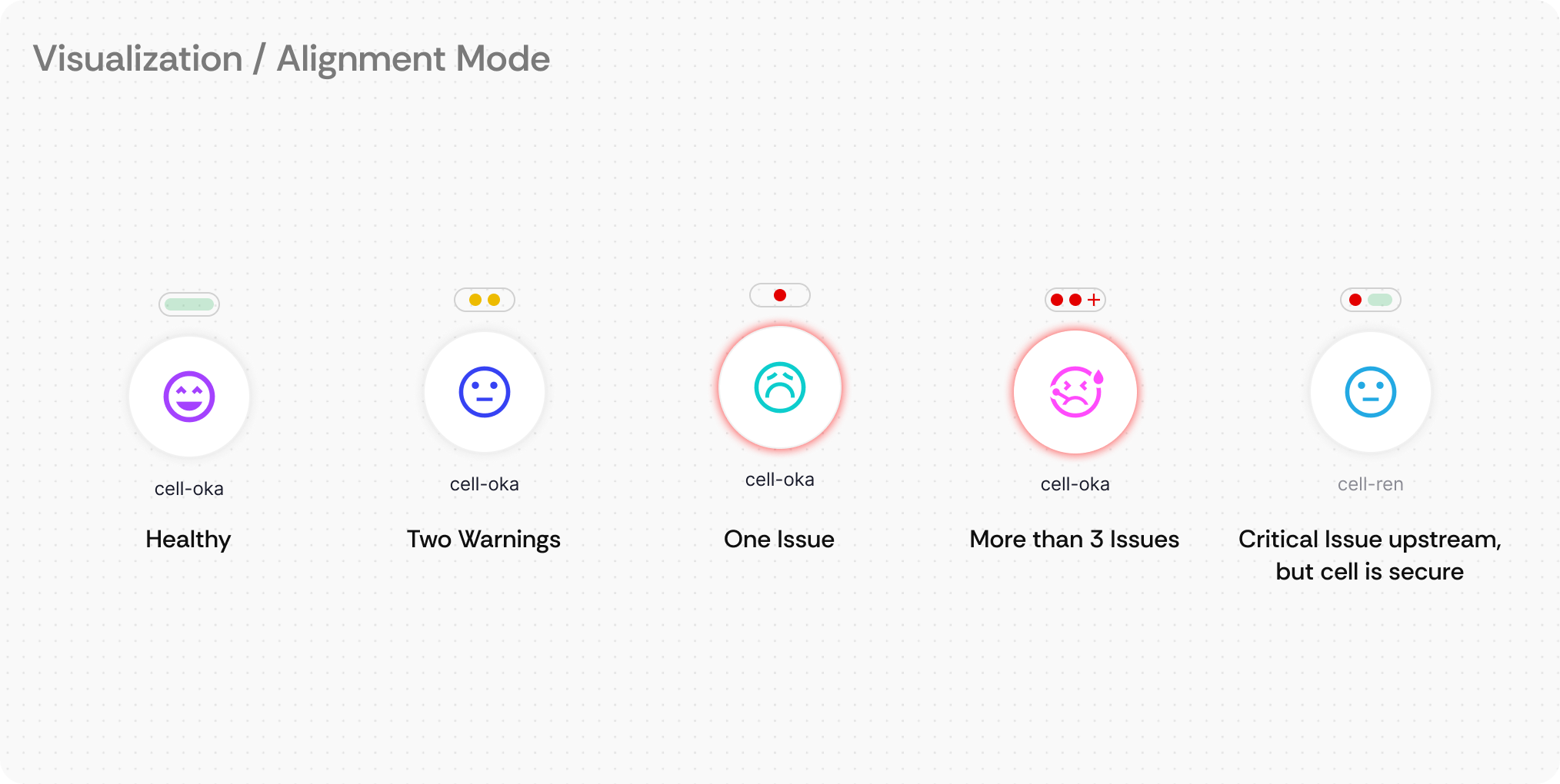
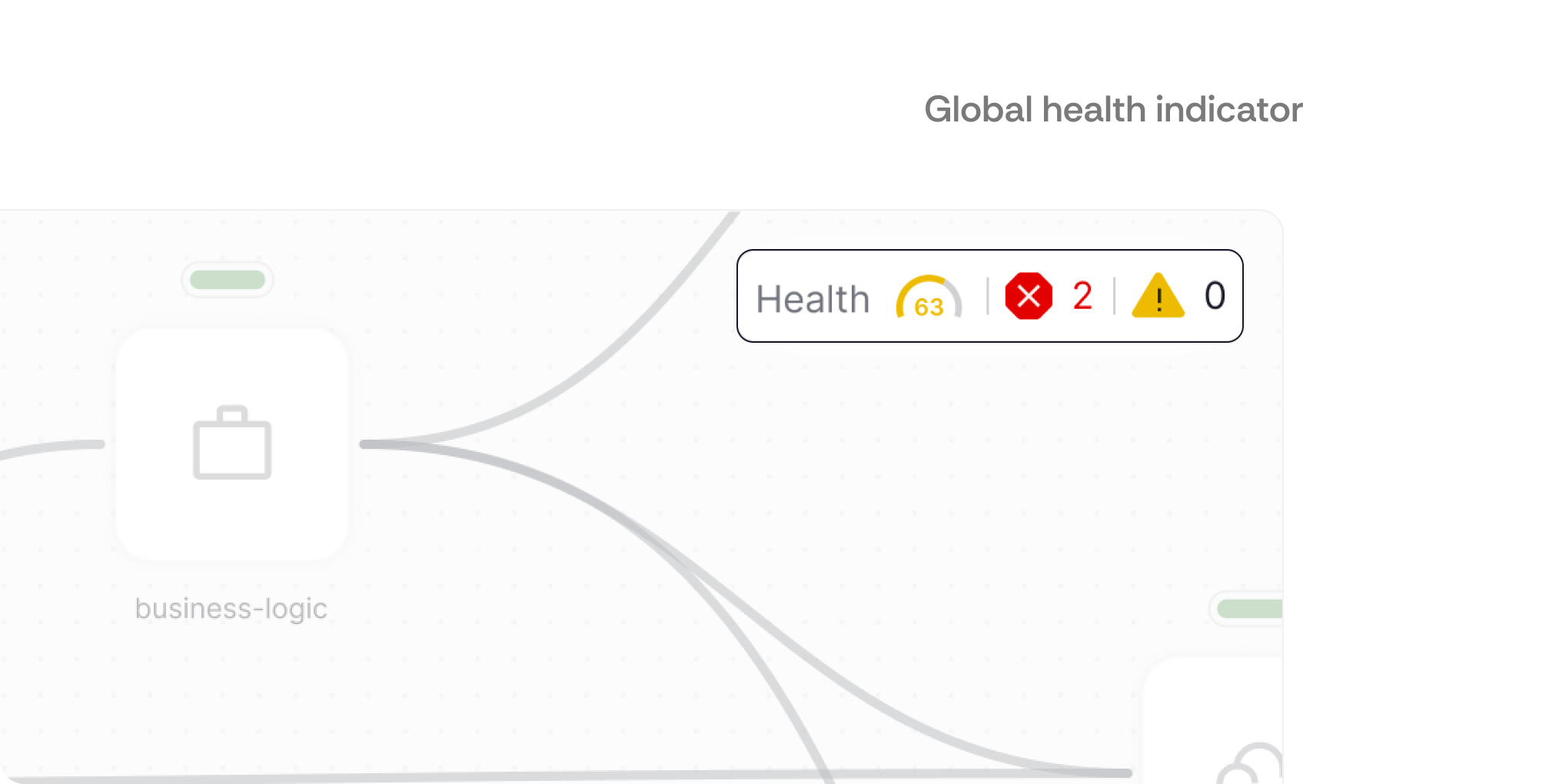
Visual Health Indicators
Color-coded health indicators on every node and connection that provide instant system status
Persistent Edge Alerts
Never miss critical issues no matter where they are.
Contents
01 Discovery & Research
02 Problem Definition
03 Solution
04 Reflection
01
Discovery &
Research
The Assignment
I received a single screenshot. No context. No constraints.
The brief was refreshingly straightforward:
"Please redesign it using your vision and preferred tools."
There were no user personas, business requirements, technical constraints, or problem statements.
Initially, I considered preparing a list of questions to gather more context. However, upon reflection, I realized this was my dream scenario to showcase my thought process.
Instead of viewing this as a limitation, I embraced it as the ultimate design challenge, an opportunity to demonstrate strategic thinking, resourcefulness, and complete ownership. Which is crucial for thriving in a startup, where navigating through uncertainty and making sense of chaos is a big part of the journey.
The Detective Work
Looking at the interface, I saw a typical network diagram, but something felt familiar. The .webp file format was my first clue that this wasn't a fresh screenshot created for the assignment.
Reverse image search revealed this was from Wiz, a $12 billion cloud security platform this opened up research pathways into:
- Competitive landscape analysis: Understanding where Wiz fits in the cybersecurity market
- User workflow research: Watching Wiz demos to understand how users navigate to this screen
- Real user feedback discovery: Diving into Reddit and forums for unfiltered user opinions
The Real Problem
My research uncovered something crucial, this wasn't just a visual design problem. It was also an information architecture problem.
Here’s something I have grabbed from Reddit about Wiz:
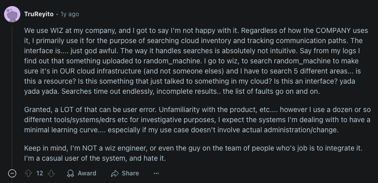
This comment revealed a core issue, users were drowning in fragmented information across multiple interfaces. Security engineers who need rapid decision making during critical incidents, were losing precious time hunting for context. This is something I have noticed when going through Wiz demos and Youtube videos.
Strategic Insight
Through my research, I identified a critical insight: the visualization provided serves two fundamentally different use cases:
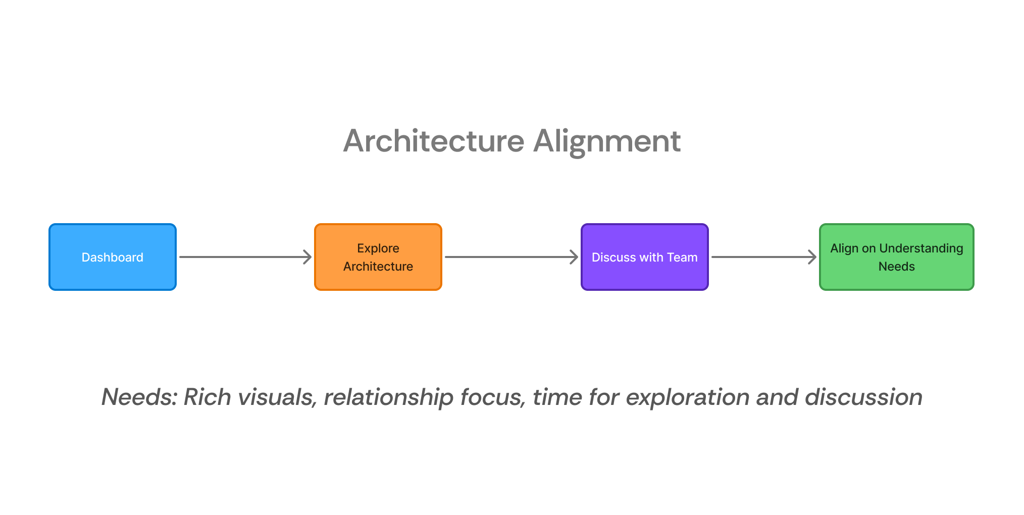
- Collaborative Architecture Alignment - Teams reviewing system structure to be on the same page and it requires:
- Colorful, engaging interfaces
- Focus on relationships and flow
- Time for exploration and discussion
- Crisis Response & Threat Hunting - Individual engineers solving urgent security issues and that requires:
- Minimal cognitive load
- Health status at a glance
- Zero tolerance for confusion
Existing tools tried to serve both masters with one interface, resulting in solutions that barely satisfied both. This became my design opportunity, why not design something that transforms based on user intent?
02
Problem
Definition
Through strategic validation with KAI and deeper research analysis, I discovered that security engineers lose critical response time when interfaces don't adapt to their cognitive context, whether they're collaborating on architecture or hunting threats under pressure.
Strategic Validation
I used assumption driven communication, sending strategic assumptions WITH targeted questions for faster turnback .
Each question revealed specific strategic insights:
"Where do users come from?" → This is a deep-dive tool, not primary dashboard. Users come with specific intent, enabling data-dense, powerful interfaces.
"What problems are they solving?" → High-stakes, time-pressure environment. Every second matters during security incidents.
"How important is this workflow?" → Key competitive differentiator, not just a feature. Investment in sophisticated UX justified.
"What's your design approach?" → Freedom to build something new vs. iterate existing patterns. Opened dual-mode innovation opportunity.
"Technical constraints?" → Periodic updates vs. real-time meant focus on core usability wins, not over-engineered features.
Combining the clarifications from KAI with the user pain points I have narrowed down the scope and derived the problem statement.
Derived Problem Statement
“Create a unified system visualization that enables security engineers to assess system health and navigate to critical issues in under 10 seconds, while supporting both collaborative architecture alignment and rapid incident response workflows?”
Problem Breakdown:
- How Might We eliminate context switching
- How Might We help navigate easily under pressure
- How Might We integrate both collaborative alignment and crisis response in a single interface
KPIs Drove my design
To avoid designing in a vacuum, I needed a clear definition of success. Rather than relying on subjective measures like "looks better" or "feels more intuitive," I established concrete KPIs that would demonstrate whether the redesign actually solved the core problem of wasted time during critical security incidents. This metrics-driven approach ensured every design decision could be evaluated against real user outcomes.
Primary KPIs:
- Time to Action ≤15 seconds
- Clicks to Insight ≤3 clicks to critical information
Why These Matter: In cybersecurity, speed equals security. These measure interface intuitiveness and exploration efficiency, the difference between catching threats and missing them.
Target User & Context
Primary User
Technical security engineers either under time pressure to resolve critical issues or need to visualize the architecture for better alignment on the project they are working on.
Daily Tasks
- Monitors 200+ cloud services
- Responds to 5-15 security alerts daily
- Uses 6-8 different security tools
- 40% investigation | 30% prevention | 30% reporting
- Frequent 3am incident response calls
Core Pain Points
- Context Switching: Loses focus across 6-8 tools during investigations
- Slow Discovery: 2-5 minutes to find specific services
- Unclear Health Status: No at-a-glance system understanding
- Collaboration Friction: Repeatedly explaining architecture to teams
Two Critical Workflows
03
Solution
After brainstorming multiple approaches and testing concepts against our KPIs, I prioritized the features that would deliver the highest impact within the project timeframe. Many ideas were scrapped in favor of focusing on the critical 20% that would solve 80% of the user pain points. The following features directly address the core workflow challenges identified through research, designed to reduce time-to-action from minutes to seconds while eliminating context-switching friction.
Feature 1:
A Single Source of Truth
What it is: A hierarchical clustering system that organizes infrastructure components into expandable groups with organic, flowing connections that represent system relationships naturally.
How users interact: Engineers can click to expand clusters to reveal underlying components, or collapse detailed views back to high-level overviews. They navigate through nested layers of infrastructure complexity while maintaining visual context at each level. It’s like a folder tree but in 2D.
Cell and Cluster Hierarchy
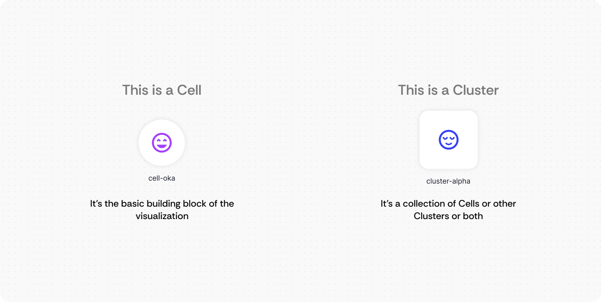
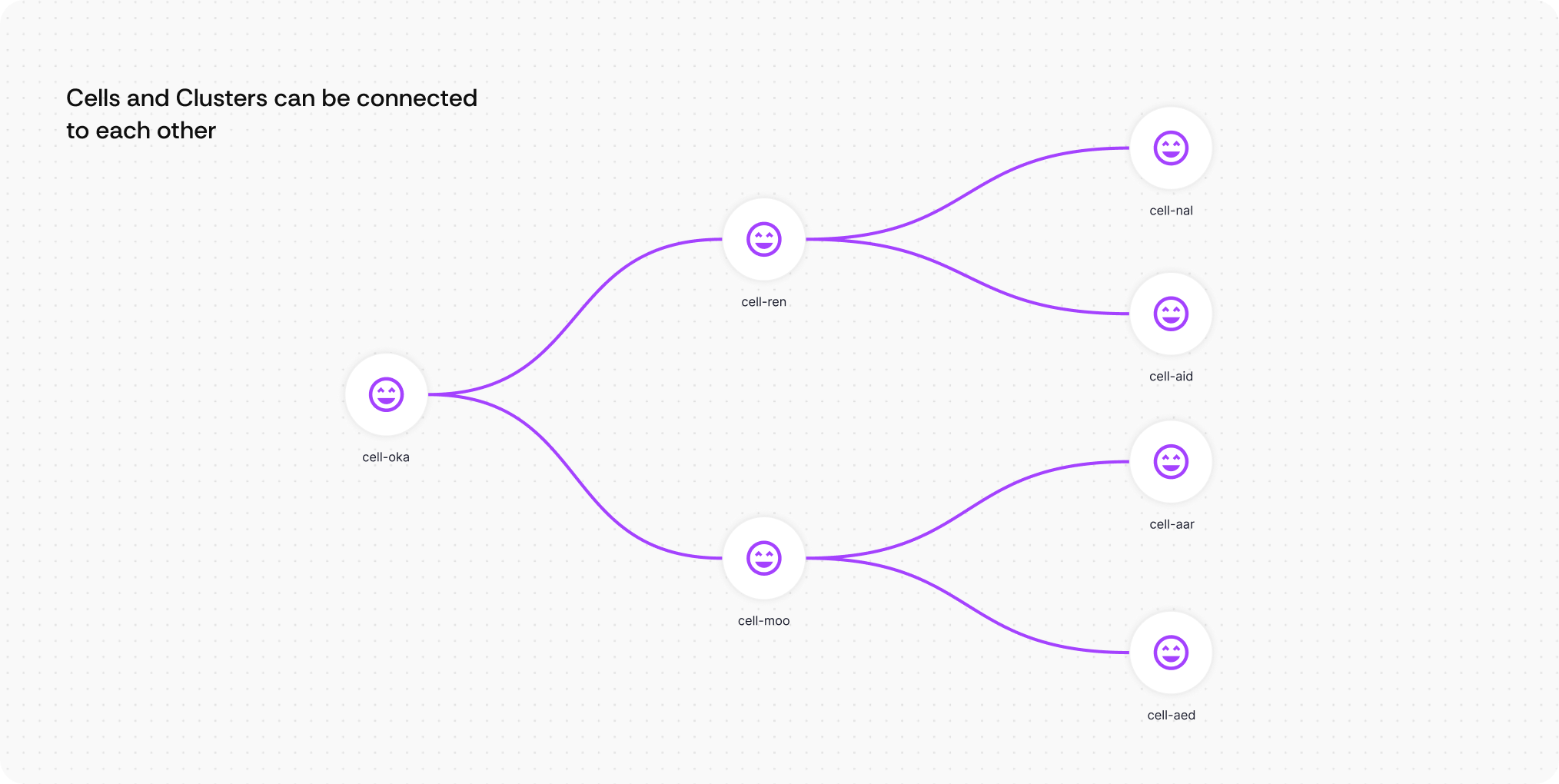
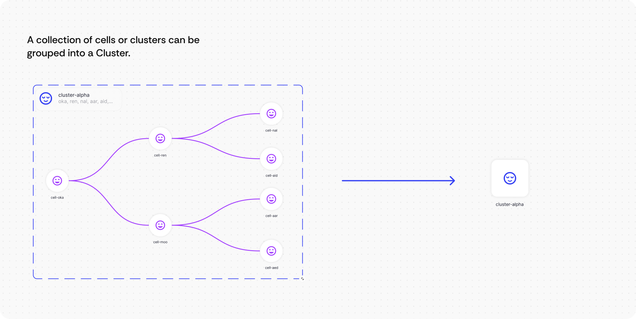
Here’s how the Clustering works
Demo - Clusters Collapsed
Demo - Clusters Expanded
Feature 2:
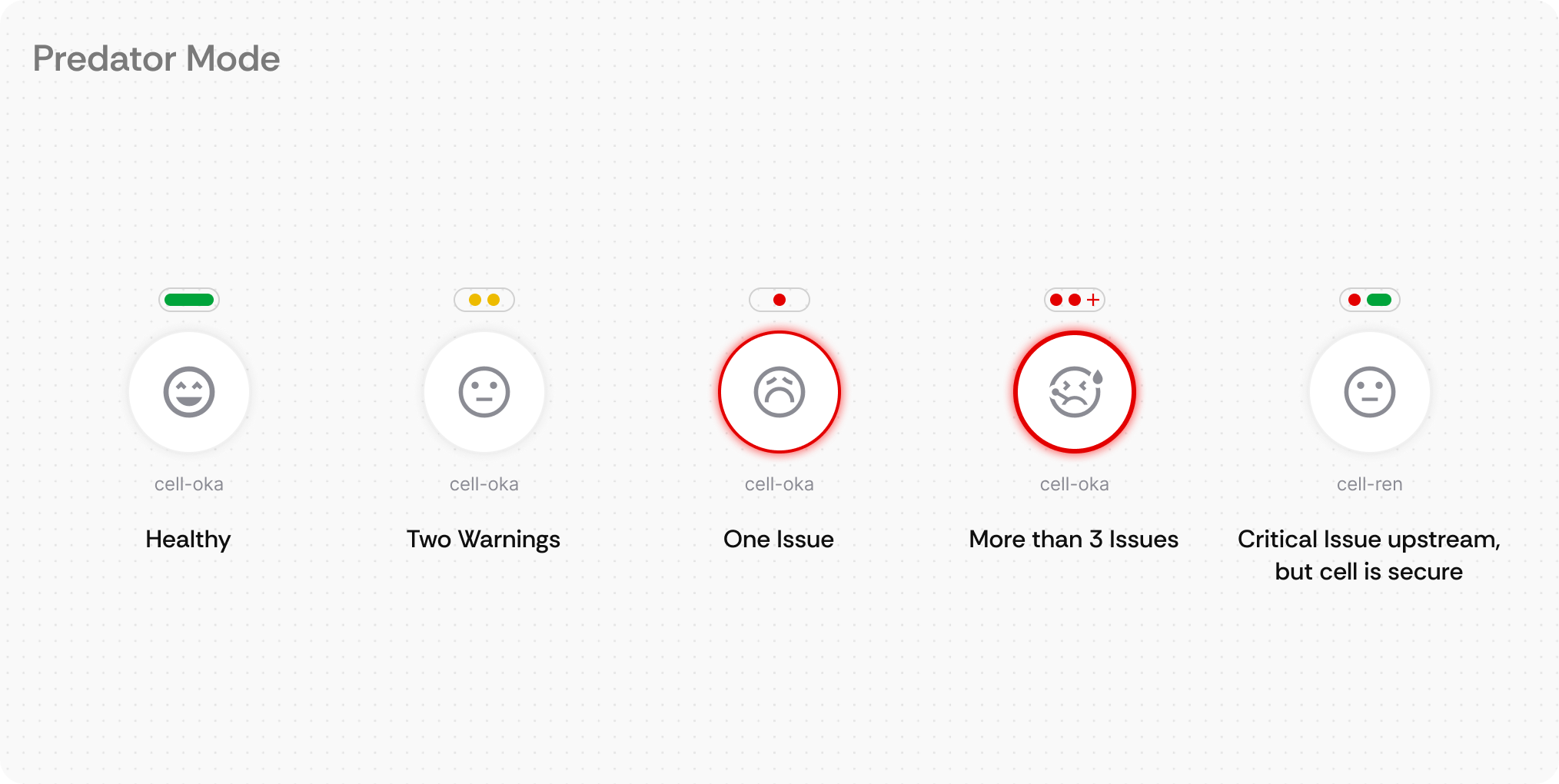
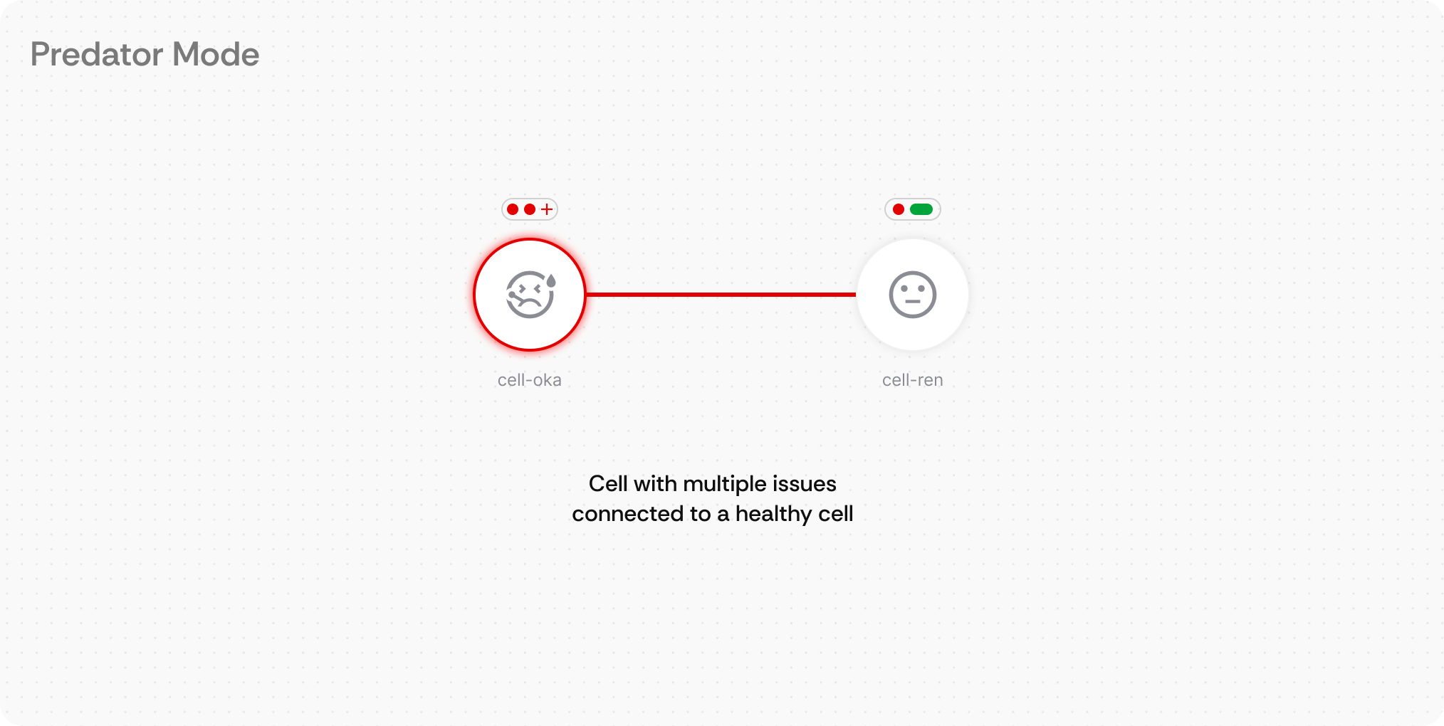
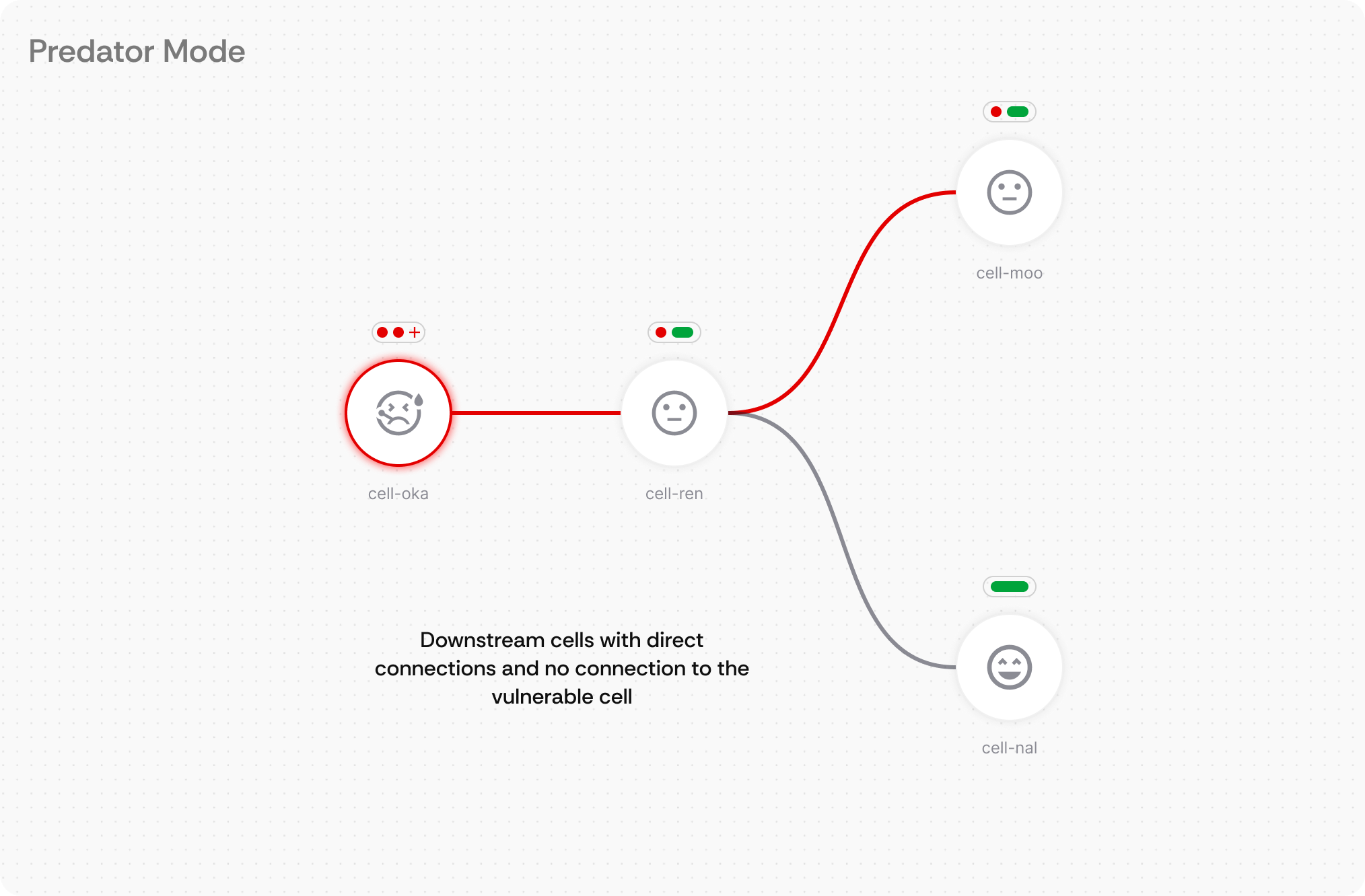
Dual-Mode Interface
What it is: A single interface toggle that transforms the visual presentation between collaborative exploration and crisis response modes.
How users interact: Engineers click the "Predator Mode" toggle in the toolbar to instantly switch from colorful, detail-rich visualization to a streamlined, health-focused interface optimized for rapid problem identification and resolution.
Demo
Feature 3:
Visual Health Indicators
What it is: Visual health indicators placed directly on each node and connection, plus a persistent global health summary in the top-right corner that provides immediate system-wide status information using color-coded dots and expandable detail panels.
How users interact: Engineers can instantly assess individual component health by scanning the color-coded indicators (green=healthy, red=critical, yellow=warning) on each node. The global health indicator in the top-right provides an always-visible system overview with total counts of issues across the entire infrastructure. Hovering over indicators reveals detailed issue breakdowns with categories and counts. Clicking the global health summary opens a comprehensive issue list with navigation to specific problems. In Predator Mode, health status also appears on connection lines for pathway-specific diagnostics.
Visual Health Indicators Basics
Demo
Feature 4:
Persistent Edge Alerts
What it is: Persistent directional indicators that appear at screen edges to show where critical issues are located outside the current viewport, with intelligent prioritization for multiple alerts.
How users interact: Engineers see directional arrow indicators pointing toward off-screen problems. Clicking an edge alert navigates directly to the issue location. When multiple alerts exist, users can access the persistent global health indicator in the top-right corner to view system-wide issue counts and click to open the comprehensive issue list where individual items can be selected to navigate to specific problem areas.
Demo
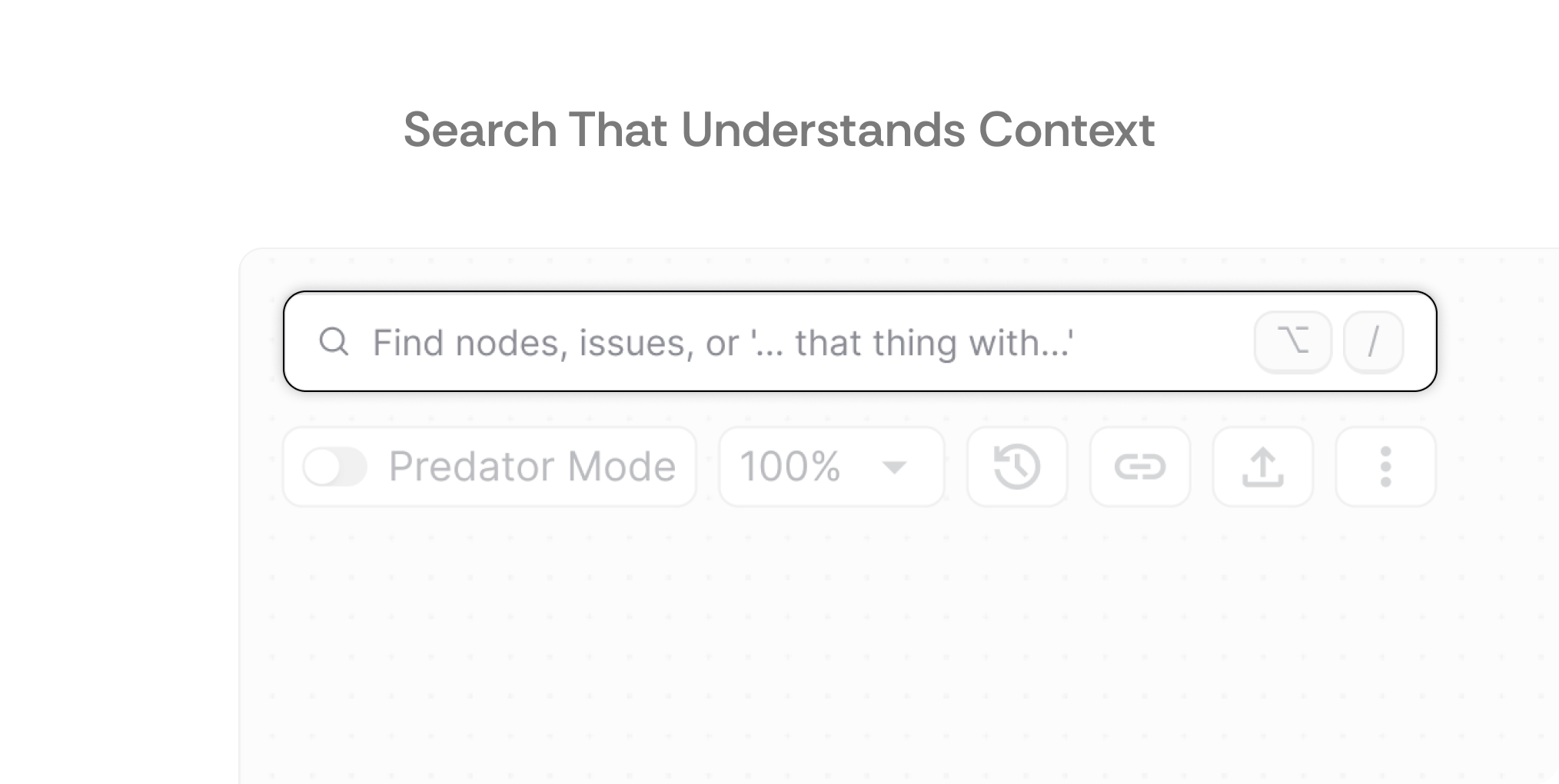
Feature 5:
Global Semantic Search
What it is: A semantic search system that interprets natural language queries and understands system relationships, accessible via keyboard shortcut for rapid access.
How users interact: Engineers can search using conversational language like "services with database connections" or exact names. The Option+/ shortcut instantly opens search from anywhere in the interface. Results understand context and relationships, making it easy to find components based on function rather than just naming conventions.
Feature 6:
Mini Map
What it is: A progressive disclosure system with consistent visual language and spatial orientation tools that make complex infrastructure feel approachable regardless of size.
How users interact: Engineers start with high-level cluster views and click to drill down into specific components. The mini-map maintains spatial context during navigation. Visual conventions (health indicators, connections, interactions) remain consistent whether viewing individual services or large cluster groups, eliminating the need to learn different interaction patterns at different scales.
Demo
04
Reflection
Thank you for providing such an open-ended assignment, this approach allowed me to demonstrate how I think through complex problems from first principles. This kind of trust in the design process, giving space to explore, question, and propose strategic solutions, reflects the kind of environment where meaningful work happens. This has been genuinely engaging and I had a lot of Fun working on this case study
Key Insight
Information architecture is everything here.
Cybersecurity platforms handle massive amounts of interconnected data - nodes, vulnerabilities, traffic patterns, access logs. When users complain about searching "5 different areas," that's not a search problem. That's an Information Architecture problem.
Here's what I'm confident about: Wiz fragmented their interface because they had to. As the platform grew, they added features, and each feature needed its own space. It's not bad design - it's the natural evolution of a product that grew fast. I genuinely understand why they made those choices.
But understanding why it happened doesn't mean accepting it as inevitable. The question becomes: can you provide a single source of truth that scales without fragmenting? That's what I tried to address with the cluster-based architecture view.
The dual-mode concept solves a real problem, but I'll be honest - I don't know if security engineers actually think in "modes." That needs validation. What I do know: cognitive load matters more under pressure, and tools should adapt to user context, not vice versa.
Future Directions
If I had another week
I'd explore connection representations beyond standard node-edge diagrams. React Flow would let me prototype this quickly. Specifically, I'd experiment with:
- Metro map-style layouts (familiar mental model, clear hierarchy)
- PCB trace-inspired routing (technical users might find it intuitive)
- Rules-based edge rendering that reduces visual noise while preserving information
These aren't just aesthetic choices - different representation styles make different patterns visible.
User testing questions
I'd shadow security engineers using competitor tools and track(or at least book a demo appointment with the competitors 🙈):
- Click counts for common tasks (basic but surprisingly revealing)
- Screen navigation patterns (where do they get stuck?)
- Workarounds they've developed (indicates where tools fail)
This isn't about optimization - it's about finding patterns competitors are locked into because they launched with them. They can't change those patterns without breaking existing users. We can.
Features I didn't design
There are a ton but these are the big ones:
Traffic visualization overlaid on a world map: Watching traffic flow and identifying attack origins in real-time. Totally a fantasy feature from movies, but also... maybe useful? And definitely engaging.
The dashboard where users land: What data lives there? How do issues get resolved - inside the platform, outside, or hybrid? That flow determines whether this map view is a destination or a waypoint.
Technical constraints I need to understand
Data characteristics: Volume, update frequency, types that need visualization. Real-time vs. periodic updates changes everything.
Why fragmentation exists: If a single source of truth is possible, why did Wiz fragment in the first place? I've watched demos but not seen actual usage. There's probably a technical constraint I'm missing.
Competitive landscape: Are Wiz, Upwind, and Prisma Cloud the only major players? What are they doing that we shouldn't replicate?
AI features roadmap: Are there planned AI capabilities that would disrupt this workflow? I can't design a map view in isolation if other features will change how users interact with their architecture.
Design IRL
I will be honest: these designs aren't accessible. The colors are representational, not WCAG-compliant. I haven't tested keyboard navigation. The contrast ratios probably fail. This is pre-accessibility-check work.
In a real sprint, I'd:
- Work with engineering to define keyboard shortcuts that match user workflows
- Test with colorblind engineers (they exist in cybersecurity)
- Add proper ARIA labels and ensure screen reader compatibility
- Validate actual contrast ratios, not just "looks good in Figma"
Closing Thoughts
My Design Philosophy
I'm not a "human-centered design purist" who spends six months researching before shipping anything. My approach is: ship fast, learn fast, fix what's broken by priority. Build the plane while flying it, but don't ignore the engine warning lights.
Business needs matter as much as user needs. A beautiful design that takes nine months to build has helped exactly zero users. An 80% solution shipping next week helps people today and gives you real data to improve tomorrow.
That's the mindset I'd bring to KAI - aggressive shipping with intentional iteration, not perfection paralysis.
On asking fewer questions
I didn't ask a ton of follow-up questions because I figured:
- You're evaluating multiple candidates and answering everyone's questions is painful, and
- Startups live in ambiguity - showing I can navigate that felt more valuable than getting perfect requirements.
Was that the right call? Maybe, maybe not. But it's how I thought about the trade-off.
On network visualizations
I didn't ask a ton of follow-up questions because I figured:
- You're evaluating multiple candidates and answering everyone's questions is painful, and
- Startups live in ambiguity - showing I can navigate that felt more valuable than getting perfect requirements.
Was that the right call? Maybe, maybe not. But it's how I thought about the trade-off.
What I learned
I just spent a day and half immersed in cloud security platforms, Reddit threads, and product demos. I'm not pretending to be a cybersecurity expert - but I do understand how people work under pressure and how interfaces either help or hinder that work.
Someone hunting an active breach thinks differently than someone reviewing architecture with their team. The interface should reflect that.
The core insight: tools should adapt to users' cognitive states, not force users to adapt to interface limitations. As Dieter Rams says, Form Follows Function.
What this means for KAI
I'm excited about this role because KAI is at the stage where design can still shape the product, not just polish it. Where "figure it out as we go" is the strategy, not a failure of planning. Where the right designer can move faster than three designers who need perfect briefs.
I don't have all the answers. But I'm good at finding the right questions, making decisions with incomplete information, and shipping things that work today while planning for tomorrow.
Looking forward to discussing what I got right, what I got wrong, and what we'd build together.